
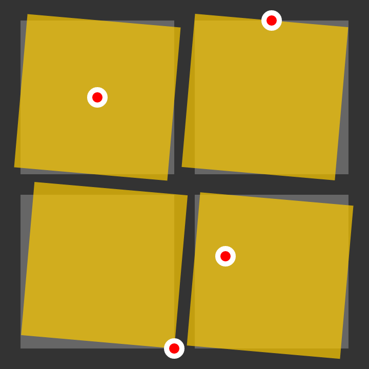
CSS 属性:transform-origin
进行变换的测量基准点。
与 transform 属性配合使用。
可能的值
| 值 | 描述 | 示例 |
|---|---|---|
| [length] | 自边界框左侧的水平距离。垂直居中。 | 100px |
| [percentage] | 自边界框左侧的水平距离,百分比是根据边界框宽度计算的。垂直居中。 | 25% |
center | 水平和垂直居中。 | |
top | 边界框的顶部边缘。水平居中。 | |
right | 边界框的右边缘。垂直居中。 | |
bottom | 边界框的底部边缘。水平居中。 | |
left | 边界框的左边缘。垂直居中。 | |
| [值] [值] | 除非使用了关键字(例如 top right),否则第一个值是自边界框左边缘的水平距离,第二个值是自边界框上边缘的垂直距离。 | 100px 25% |
| [值] [值] [长度] | 用于 3D 变换。如 [值] [值],附加的长度值用于定义 z 轴上的位置。 | 50px bottom 25px |
inherit | ||
initial | ||
unset | ||
示例
#pool {
    transform-origin: top;
    transform: rotate(10deg);
}
/* Rotates the box 10 degrees clockwise around the top-center point. */

#loch {
    transform-origin: -20px -40px;
    transform: rotate(-20deg);
}
/* Rotates the box 20 degrees counter-clockwise around a point 40px above and 20px to the left of the top-left corner. */